15.3 Exploring Bivariate Data Graphically
Related Content Standards
- (7.SPB.3) Informally assess the degree of visual overlap of two numerical data distributions with similar variabilities, measuring the difference between the centers by expressing it as a multiple of a measure of variability.
In addition to using each of the graphical displays shown above to understand a single variable, we can use these displays to compare the distributions for different subsets of the population. For example, we will compare the time between eruptions for Old Faithful with two other geysers in Yellowstone National Park, Daisy and Riverside.
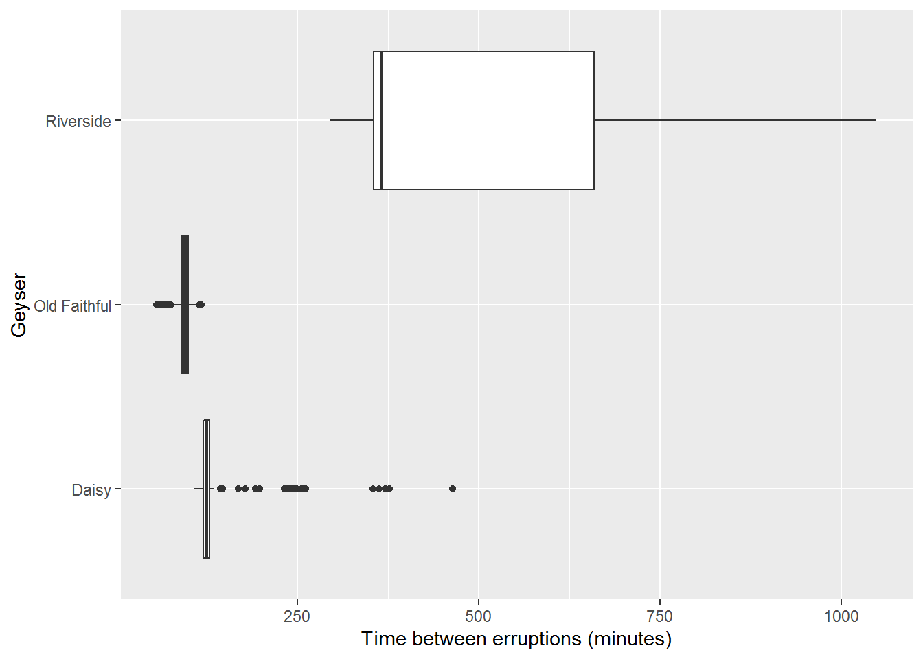
Figure 15.10: Box Plot Comparing Erruption Times of Geysers
We can see from a comparison of their box plots that Old Faithful is definitely the most regular of the three geysers. But Daisy is also very regular, with a little longer of time between eruptions since the box is similar in size to Old Faithful and shifted to the right. Some of the longer lengths in eruptions for Daisy may be due to a missed eruption in the recordings. Particularly since it is not as popular of a geyser, not all of its eruptions may have been recorded. This hypothesis is further supported by clusters of outliers around two and three times the length of the eruptions for Daisy and Riverside is highly skewed right. This exploratory data analysis would then lead to a further study of the geysers with more reliable methodology to determine the time between geyser eruptions.
These graphical representations are helpful to discover relationships between an ordinal or continuous variable and a categorical variable. In the displays above, we can think of the name of the geyser as a categorical variable and the time between eruptions as a continuous variable.
15.3.1 Scatterplots
It is sometimes useful to see how two continuous or ordinal variables interact with each other. To explore this interaction, a scatterplot of the data is often very helpful. For some of the eruptions of Old Faithful in July 2020 we have the length of the eruption recorded. With this additional information we create a scatterplot of the length of the previous eruption and the time between eruptions.

Figure 15.11: Scatterplot Comparing Erruption the Duration of Prior Eruptions and the Times Between Erruptions (R)
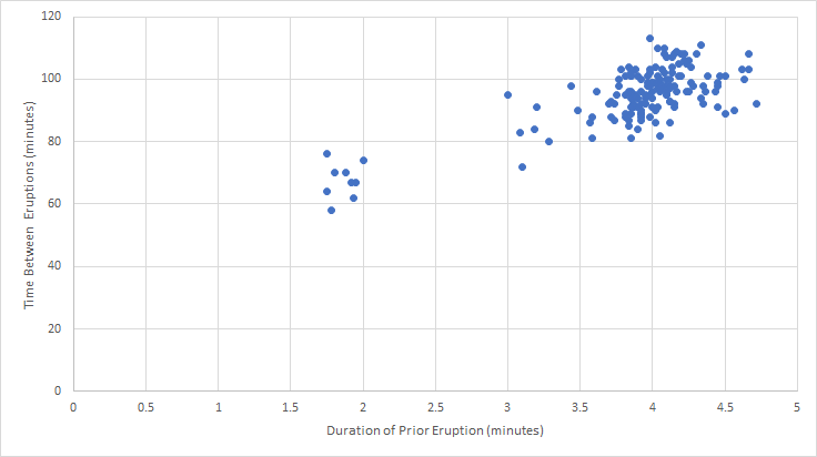
Figure 15.12: Scatterplot Comparing Erruption the Duration of Prior Eruptions and the Times Between Erruptions (Excel)
While these two scatterplots may look different, it is primarily from different scales on the axes. This reminds us that we need to look at all of the information in a graph, rather than an initial scan.
From this scatterplot, we can see two main clusters of eruptions, those with around 2 minute long eruptions that then have around 70 minutes until the next eruption and those with four minute eruptions with the next eruption around 90 minutes later. This could lead to a hypothesis that the length of an eruption influences the time until the next eruption. Remember that we cannot say anything definite here. Instead, we can create hypotheses and more detailed research plans to build upon these exploratory analyses to develop a more rigorous argument.
Related Content Standards
- (8.SPA.1) Construct and interpret scatter plots for bivariate measurement data to investigate patterns of association between two quantities. Describe patterns such as clustering, outliers, positive or negative association, linear association, and nonlinear association.
15.3.2 Exercises
Use the Census at School Random Sampler https://ww2.amstat.org/censusatschool/ to create a spreadsheet with 1000 random students. Use this data set to explore possible relationships between pairs of the variables of
Gender,Age_years,Height_cm, andArmspan_cmusing the techniques discussed in this section. Create a report to discuss your findings.Use the tools from this section to explore possible relationships between pairs of variables of nutrition information of regular soft drinks, juices, milk, and sports drinks.
Discuss the different graphical representations for different combinations of types of variables.
- Categorical and Count
- Categorical and Continuous
- Continuous and Binomial
- Continous and Continous
- Ordinal and Categorial