15.2 Exploring Univariate Data Graphically
The data analysis investigative process often begins by a person exploring an existing data set looking for possible phenomena or relationships that lead to further questions to be tested using a more systematic statistical analysis. Both the exploration of relationships and the confirmation of hypothesized relationships are valuable, but they serve different purposes.
The primary goals of exploratory data analysis (EDA) revolve around getting to know a set of data and allowing the data to guide further discoveries. Behrens & Yu (2003) describe it as similar to a “detective looking for clues to develop hunches and perhaps seek a grand jury” (p. 42). EDA uses many tools, particularly graphical representations, to reveal possible relationships, understand measurement error and variability, transform variables, and better understand the role of outliers. Throughout this section we will describe these different tools and how they are used in spreadsheets and R.
In the early stages of research, EDA is valuable to help find the unexpected, refine hypotheses, and appropriately plan future work. In the later confirmatory stages, EDA is valuable to ensure that the researcher is not fooled by misleading aspects of the confirmatory models or unexpected and anomalous data patterns. (Behrens & Yu, 2003, p. 60)
As an example of the process of exploratory data analysis and different ways of representing a set of data, we will look at the time between geyser eruptions of Old Faithful for July 20206. Using the information downloaded about the time of eruptions, we create a column in a spreadsheet called inter_eruption_time that is calculated based on the time of the eruption and the time of the prior eruption in minutes.
15.2.1 Histograms
We will begin our exploration of the Old Faithful data with a histogram with a binwidth of 15 minutes to show the number of minutes between eruptions.
Using Excel or Google Sheets, we can highlight the column and insert a histogram.
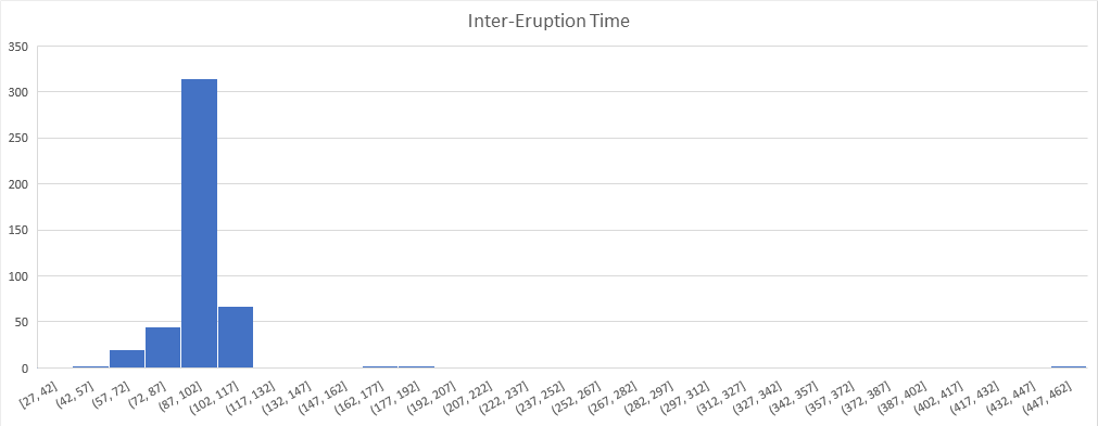
Figure 15.1: Histogram with 15 minute binwidth using Excel
Alternatively we can use R and the readxl and ggplot2 packages to create a histogram.
# Load required packages
library(readxl)
library(ggplot2)
After loading the appropriate packages, we can read the Excel file into the data frame of Old_Faithful_2020_07_01_to_2020_07_31. This can then be used to create the histogram with the binwidth of 15 minutes.
ggplot(Old_Faithful_2020_07_01_to_2020_07_31, aes(x=inter_erruption_time)) + geom_histogram(binwidth = 15) + labs(x= "Time between erruptions (minutes)")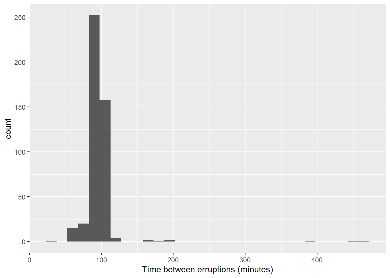
We notice that the vast majority of the time, the number of minutes between eruptions is less than 200 minutes, with a few over 400 minutes. Going back to the context of the data and looking at these eruptions that had more than 120 minutes, they all occurred during nighttime hours. So we will make the assumption that the data source is missing eruptions and so we will remove these data points from our frame. We then create a new histogram with a binwidth of 5 minutes on this cleaned data set in both Excel and R.
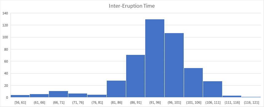
Figure 15.2: Histogram with 5 minute binwidth using Excel
ggplot(Old_Faithful_2020_07_01_to_2020_07_31_cleaned, aes(x=inter_erruption_time)) + geom_histogram(binwidth = 5) + labs(x= "Time between erruptions (minutes)")+theme_classic()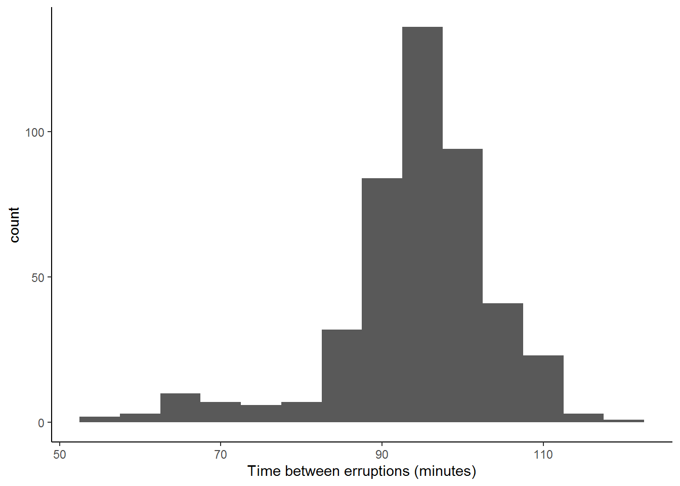
Figure 15.3: Histogram with 5 minute binwidth using R and ggplot2
Related Content Standards
- (6.SPB.4) Display numerical data in plots on a number line, including dot plots, histograms, and box plots.
15.2.2 Dot Plots
From this histogram we see that the data seems to have two ‘centers’ (one at around 95 minutes and the other around 65 minutes). To explore this phenomenon further, we create a dot plot that marks each occurance as a single dot and see that there appear to be two clusters of times.
ggplot(Old_Faithful_2020_07_01_to_2020_07_31_cleaned, aes(x=inter_erruption_time)) + geom_dotplot(binwidth = .5) + labs(x= "Time between erruptions (minutes)")+theme_classic() + scale_y_continuous(NULL, breaks = NULL)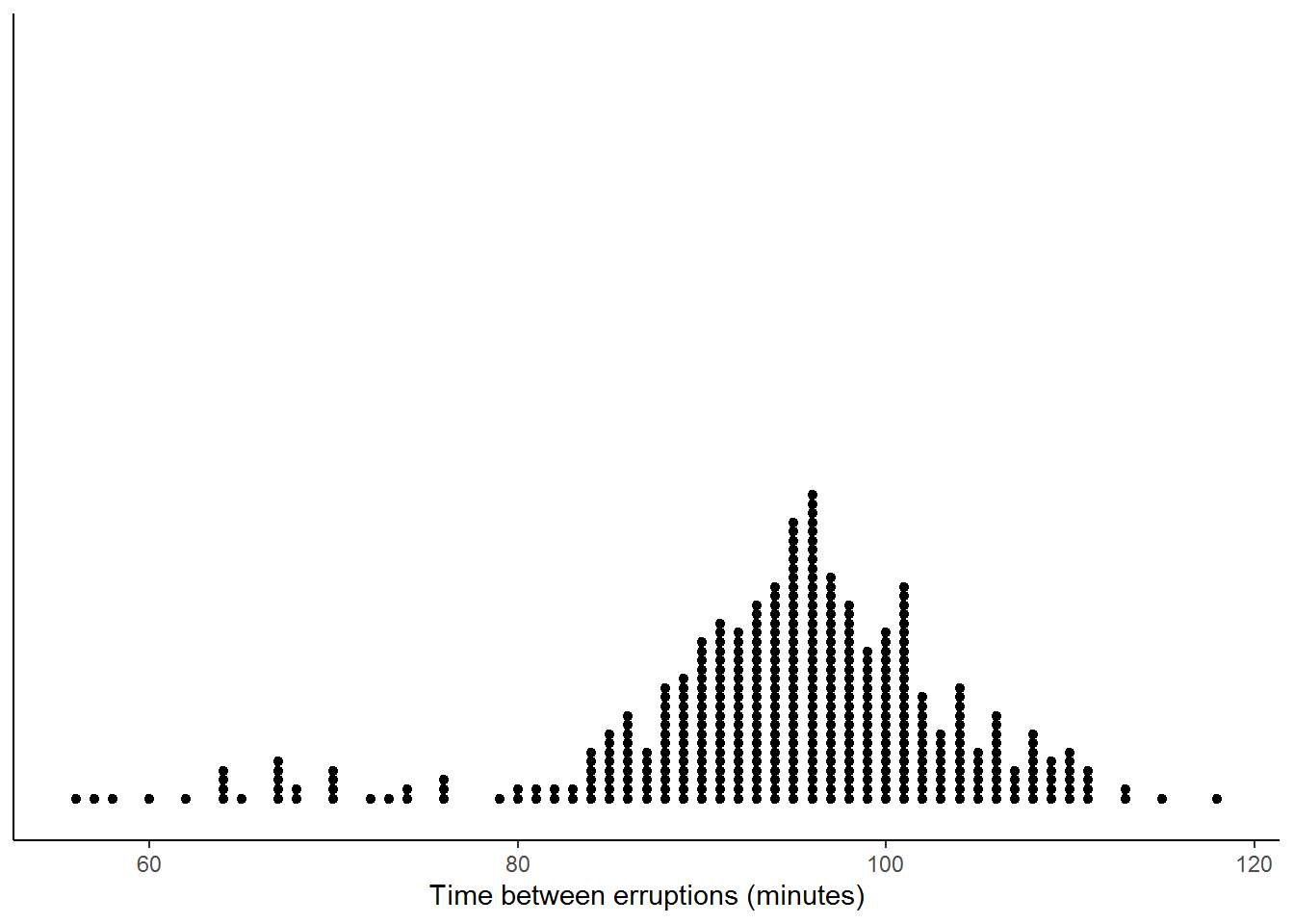
Figure 15.4: Dot Plot of Eruption Times using R and ggplot2
While spreadsheet applications do not create such dot plots easily, you can use GeoGebra or Desmos to create dot plots.
15.2.3 Density Plots
Since the dot plot represents the information from a single month and the times between eruptions is a continuous variable, we can generalize the dot plot to a continuous density plot.
ggplot(Old_Faithful_2020_07_01_to_2020_07_31_cleaned, aes(x=inter_erruption_time)) + geom_density(kernel = "gaussian") + labs(x= "Time between erruptions (minutes)")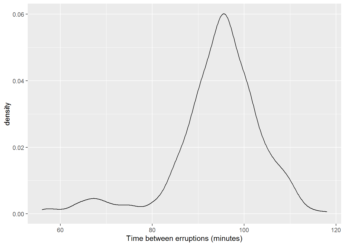
Figure 15.5: Density Plot of Eruption Times
15.2.4 Box Plots
When we display this same data on a box plot (also called a box-and-whisker plot).
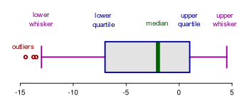
Figure 15.6: Box Plot with Labels
We see that the box plot divides the data up into quarters. This means that 50% of the data is inside the box between the lower quartile (Q1) and the upper quartile (Q3).
We see in the figure below of our eruption data that many of the data points lie more than 1.5 times the inner-quartile range (IQR) below the first quartile (Q1) or above the third quartile (Q3), as denoted by the dots past the whiskers. These data points are often called outliers.
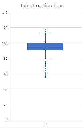
Figure 15.7: Box Plot of Time Between Eruptions Using Excel
ggplot(Old_Faithful_2020_07_01_to_2020_07_31_cleaned, aes(x=inter_erruption_time)) + geom_boxplot() + labs(x= "Time between erruptions (minutes)") + scale_y_continuous(NULL, breaks=NULL)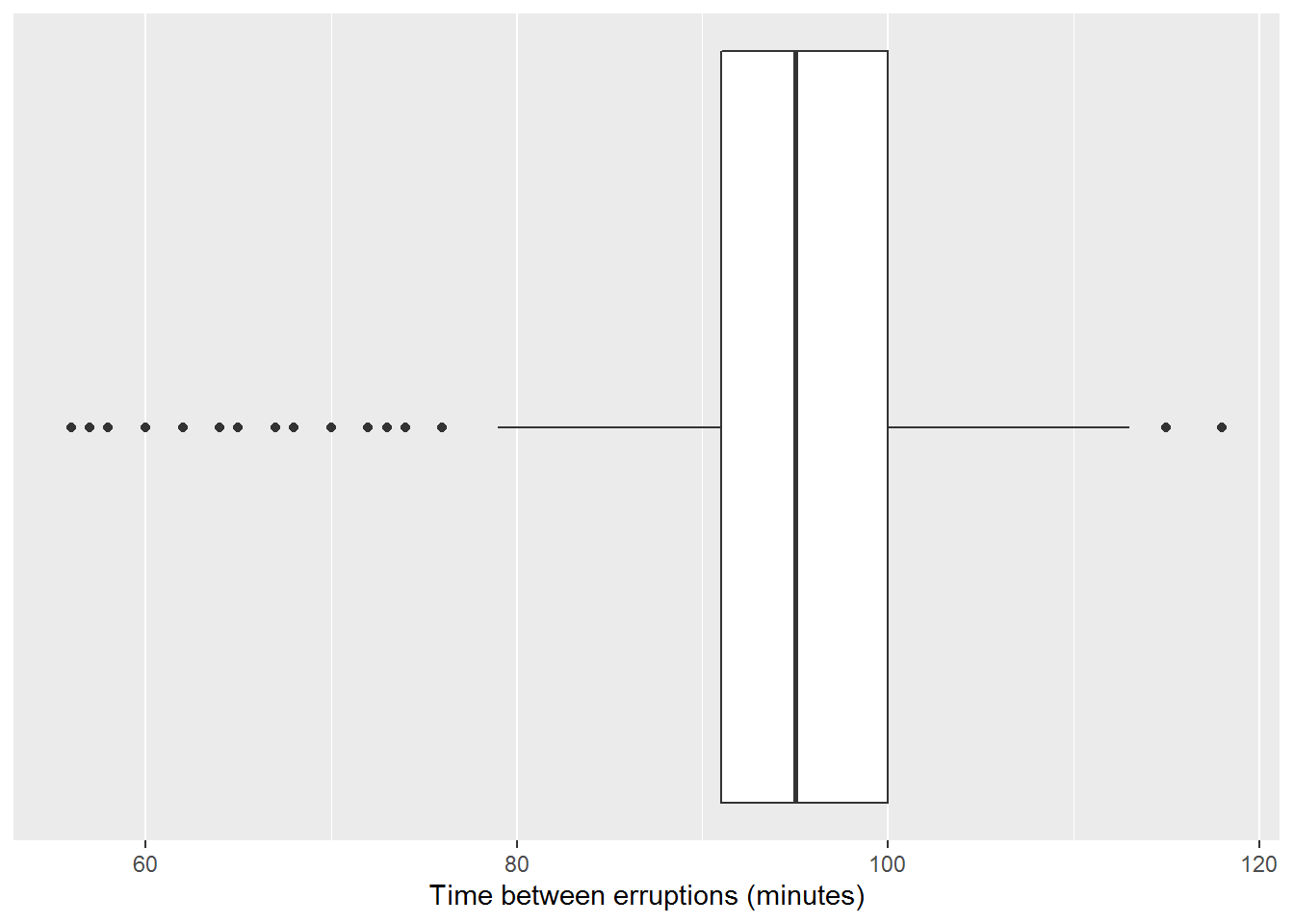
Figure 15.8: Box Plot of Eruption Times Using R and ggplots2
The large number of outliers below 78 minutes corresponds to the second cluster of times centered around 65. From the evidence gathered to this point, we can justify making the assumption that there are really two different lengths of time between eruptions, “Short” and “Long”. By labeling the wait time as short or long, we can look at the two different distributions using a pair of box plots.
ggplot(Old_Faithful_2020_07_01_to_2020_07_31_cleaned, aes(inter_erruption_time, wait_cat)) + geom_boxplot() + labs(x= "Time between erruptions (minutes)", y= "Prior eruption length")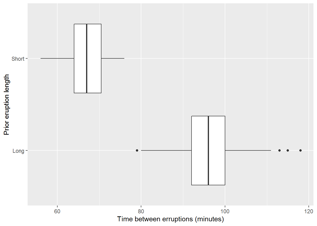
Figure 15.9: Box Plot of Eruption Times Based on Prior Eruption Using R and ggplots2
15.2.5 Exercises
Use the Census at School Random Sampler https://ww2.amstat.org/censusatschool/ to create a spreadsheet with 1000 random students. Use this data set to explore the variables of
Gender,Age_years,Height_cm, andArmspan_cmusing the techniques discussed in this section. Create a report to discuss your findings.Use the tools from this section to explore the sugar content of regular soft drinks, juices, milk, and sports drinks.
References
Downloaded from https://geysertimes.org/retrieve.php↩︎