15.5 Measures of Variability
While the center of a data set gives us a partial description of the values of a variable, we need ways to describe how much variability exists in the data to more fully understand the situation.
One aspect of a location that people consider when choosing places to live are how hot it will be. The average high temperature in 2019 in Phoenix and Honolulu were both 86\(^\circ\) F10. Since the average temperatures are a balance between the highs and lows, these two cities can have the same average temperatures, even though they have drastically different climates. So it is helpful to have numerical measures of how much variation exists.
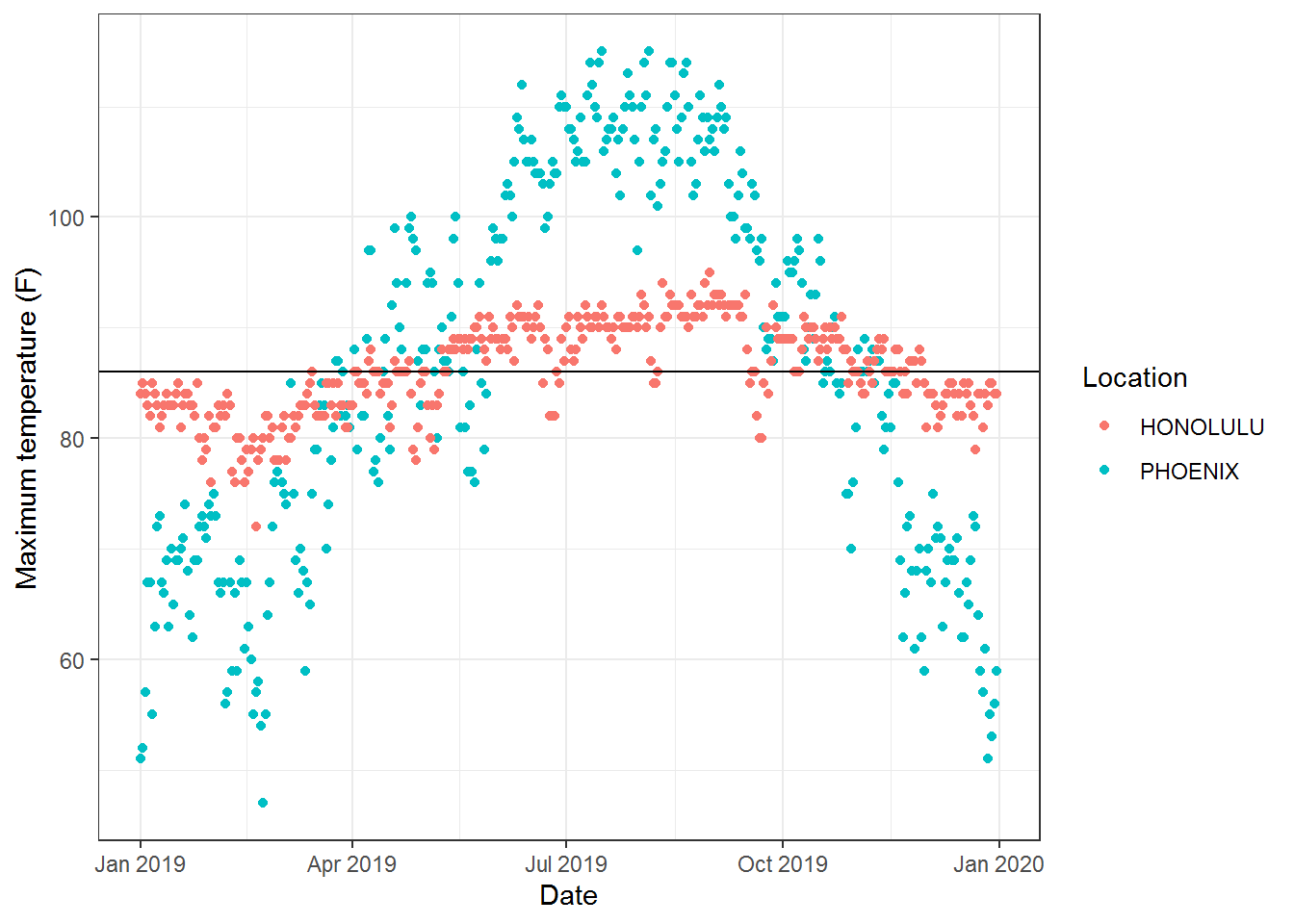
Figure 15.13: Temperatures for Phoenix and Honolulu
The first measure of variability focuses on the range of the middle half of the data.
Definition 15.5 The innerquartile range (IQR) is based on the division of the data set into quartiles, Q1 is the median of the lower half of the ranked data set, Q2 is the median of the data set, and Q3 is the median of the upper half of the ranked data set. The IQR of the data set is then Q3-Q1.
In our example comparing the temperatures of Phoenix and Honolulu, we see these quartile values are very different.
| Q0 (Min) | Q1 | Q2 (Median) | Q3 | Q4 (Max) | IQR | |
|---|---|---|---|---|---|---|
| Phoenix | 47 | 72 | 87 | 102 | 115 | 28 |
| Honolulu | 72 | 83 | 86 | 90 | 95 | 7 |
These values are represented graphically in the box plots with Q1 being the left side of the box, Q3 being the right side of the box, and IQR being the width of the box.
ggplot(HonoluluPhoenixClimate, aes(TMAX)) + geom_boxplot(aes(colour = factor(NAME))) + labs(x= "High Temperatures") + theme(legend.title = element_blank())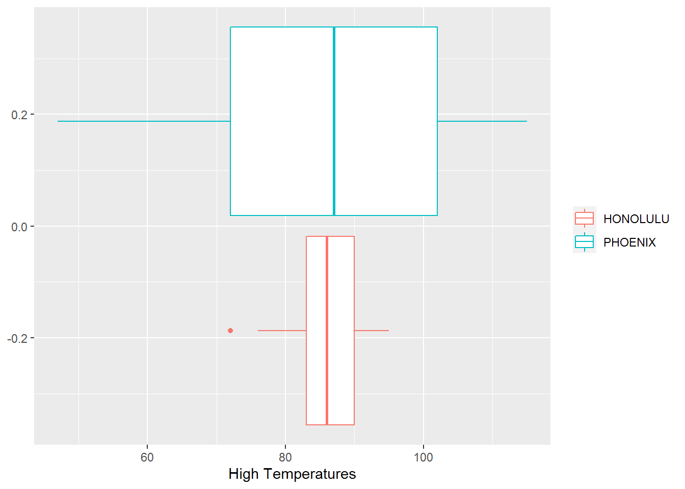
Figure 15.14: Box Plot Comparing Temperatures of Phoenix and Honolulu
While the quartiles are commonly used to describe the variation of a data set in terms of its middle values, we will see in later chapters that with hypothesis testing it is standard to look for the location of 95% of the values in a data set.
Definition 15.6 A 95-percent coverage interval describes the interval within which 95% of the data exists in a data set.
For the temperature example, we find that 95% of the high temperatures in Phoenix lie in the interval \((59.0, 110.8)\), while in Honolulu 95% of the high temperatures lie in the interval of \((79.0,92.0)\). This further differentiates the climate of Honolulu from Phoenix in that almost every day in Honolulu is within most people’s comfort level, while there are many days in Phoenix for which people are uncomfortable being outside.
ggplot(HonoluluPhoenixClimate, aes(DATE, TMAX)) + geom_point(aes(colour = factor(NAME))) + labs(x="Date", y="Maximum temperature (F)", colour = "Location") + geom_hline(aes(yintercept=79), color="red", size=2) + geom_hline(aes(yintercept=92.0), color="red", size=2) + geom_hline(aes(yintercept=59), color="cyan", size=2) + geom_hline(aes(yintercept=110.8), color="cyan", size=2)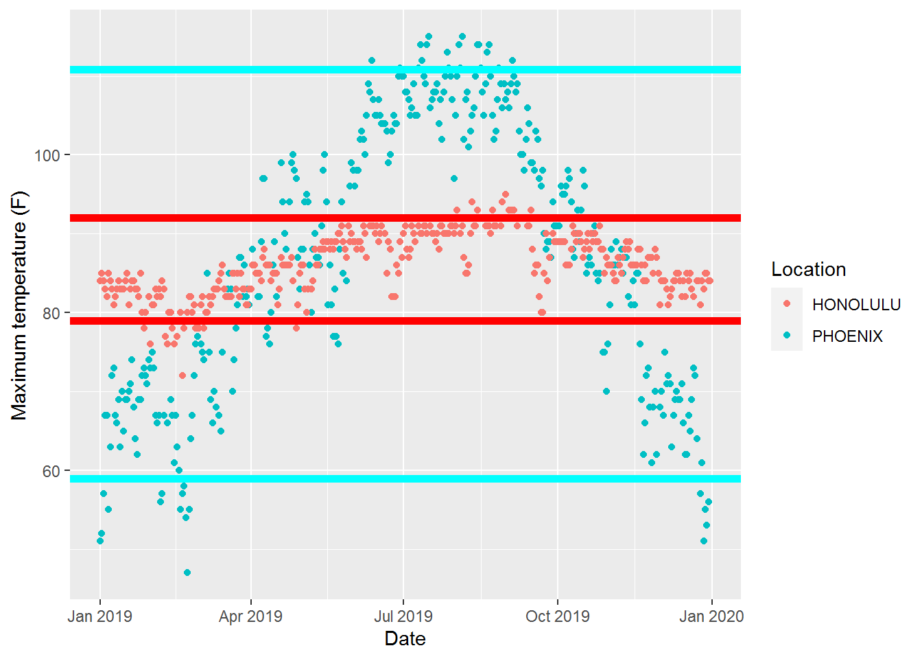
Each of the prior methods of measuring variability involves ranking the data and then describing the data that fits within certain intervals. Because these measures of variability depend only on the rank of the data, they can be used with either ordinal or continuous data.
When a variable is a continuous numeric variable, another way to describe the variability is to measure how much the data set differs from one of the centers of the data set. With such measurements, we want the value to become more reliable as we increase the number of points in our data set and so we want to measure some type of average of distances from the center. The most basic of these measure is the mean absolute deviation.
Definition 15.7 The mean absolute deviation of a data set is the mean of the absolute values of the differences from the center of the data set. If our data set is \(\{x_1, x_2, x_3, \ldots, x_n\}\), with center of \(\overline{x}\), then the mean absolute deviation of the set is \[\frac{1}{n} \sum_{i=1}^n |x_i-\overline{x}|.\]
While any center of the data set could be used, the most common center for the mean absolute deviation is the arithmetic mean.
The mean absolute deviation can be found using spreadsheets with the function AVEDEV and in R using MeanAD.
For Phoenix, the mean absolute deviation in the temperatures is 14.5 degrees, while Honolulu is only 3.4 degrees. This gives another single quantity that demonstrates that Honolulu has much less variability in temperatures.
Related Content Standards
- (6.SPB.5) Summarize numerical data sets in relation to their context, such as by:
- Giving quantitative measures of center (median and/or mean) and variability (interquartile range and/or mean absolute deviation), as well as describing any overall pattern and any striking deviations from the overall pattern with reference to the context in which the data were gathered.
- Relating the choice of measures of center and variability to the shape of the data distribution and the context in which the data were gathered.
While the mean absolute deviation is easy to compute and interpret, it does not work well with mathematical statistics based on the theory of probability. So the most common measures of variability are based on the average of the squares of the differences from the mean, similar to the distance formula between points in \(\mathbb{R}^n\).
Definition 15.8 The standard deviation of a data set \(\{x_1, x_2, \ldots, x_n\}\) with mean of \(\overline{x}\) is given by \[\sigma = \sqrt{ \frac{1}{n} \sum_{i=1}^n \left(x_i - \overline{x}\right)^2}.\] The variance of the data set is the square of the standard deviation, \[\mathrm{Var} = \sigma^2 = \frac{1}{n} \sum_{i=1}^n \left(x_i - \overline{x}\right)^2.\]
We will look at some of the key properties of the variance in the next chapter on probability, but one key aspect of the variance is that it is equal to the difference between the mean of the squares and the square of the means of the values in the data set, \[\sigma^2 = \left(\frac{1}{n} \sum_{i=1}^n x_i^2\right) - \left( \frac{1}{n} \sum_{i=1}^n x_i \right)^2.\]
The spreadsheet functions to find the standard deviation and variance for a population are STDEV and VAR with the corresponding functions in R being sd and var. If the data set represents a sample of a larger population, the formulas and commands are slightly different and will be discussed in Chapter 16.
When we compute the standard deviation and the variance of the high temperatures for Phoenix and Honolulu, we find that the standard deviations (16.98 and 4.10 degrees, respectively) are similar to the mean absolute deviations, with the standard deviations being slightly larger.
15.5.1 Exercises
Use the Census at School Random Sampler https://ww2.amstat.org/censusatschool/ to create a spreadsheet with 1000 random students. Use this data set to explore the variability of the variables of
Age_years,Height_cm,Travel_time_to_school, andArmspan_cmusing the techniques discussed in this section. Create a report to discuss your findings.How would ‘outliers’ affect the different measures of variability?
List out the measures of variability in this section and describe possible uses for each of them.